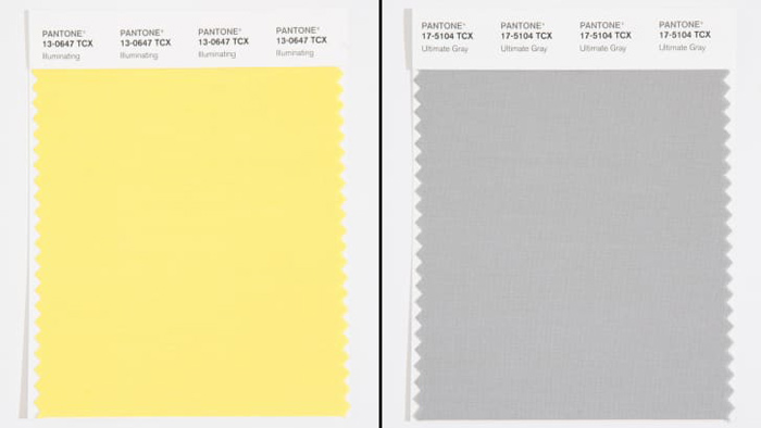
潘通發布2021年度代表色:極致灰和熒光黃 Pantone unveils its 2021 Color(s) of the Year: Ultimate Gray and Illuminating
中國日報網 2020-12-10 14:23


全球權威色彩機構潘通剛剛發布了2021年的代表色——極致灰和熒光黃。極致灰象征著平靜和剛毅,熒光黃則象征著樂觀和活力。潘通希望這兩種色彩的組合可以為人們帶來希望和力量。

As 2020 nears its tumultuous end, the Pantone Color Institute has taken up its annual task of forecasting the color that will best reflect the year ahead.
2020年即將在一片混亂中走向尾聲之時,潘通色彩研究所發布了代表2021年度趨勢的色彩。
And, in a decision befitting a complex time, the color authority -- which standardizes swatches for the design industry -- has revealed not one, but two hues for its Color of the Year: the neutral Ultimate Gray and vibrant yellow Illuminating.
在這個復雜的情勢下,為設計行業提供標準色卡的這個色彩權威機構本次發布的年度色彩不是一個,而是兩個:極致灰和熒光黃。
swatch [swɑ?t?]: n. 樣本,樣品
"It's a combination that speaks to the resilience, the optimism and hope and positivity that we need, as we reset, renew, reimagine and reinvent," said Laurie Pressman, vice president of the Pantone Color Institute, in a video call along with executive director, Leatrice Eiseman.
潘通色彩研究所的副所長勞里·普雷斯曼在和執行董事莉雅翠絲·艾斯曼一起參加的視頻通話中表示:“這個色彩組合代表了我們在重置、重啟、重構和改造過程中所需要的適應力、樂觀、希望和積極性。”
It's the first time an achromatic shade (gray) has been selected, and the second time two colors have been chosen. In 2016, the pale pink and blue hues, Rose Quartz and Serenity broke the norm when they were presented as a gradient.
這是潘通首次選擇非彩色顏色(灰色)作為年度色,在一個年度選出兩個代表色則是第二次。2016年潘通曾打破常規,選擇水晶粉和寧靜藍兩種色彩的漸變組合作為年度色彩。
achromatic [,?kr?'m?t?k]: adj. 非彩色的
gradient [?ɡre?di?nt]: n. 漸變

Though Pantone selecting two colors might be seen as hedging its bets -- a gray or yellow, depending on how 2021 unfolds -- Pressman and Eiseman want people to consider the colors' impact as a unified pair, hinting at the importance of solidarity in the coming year.
盡管潘通選擇的這兩種顏色好似在兩面下注,是灰色還是黃色更合適,取決于2021年的走向。不過普雷斯曼和艾斯曼希望人們將這兩種顏色作為一個統一的整體來看待其影響,暗示著來年團結一心的重要性。
"Two extremely independent colors highlight how different elements come together to express this message of strength and hopefulness," said Pressman.
普雷斯曼說:“兩個極為獨立的顏色凸顯出不同的因素如何一起傳達出力量和希望的訊息。”
The only other time an optimistic yellow hue has been selected was during another widespread economic crisis. For 2009, Pantone chose the lively Mimosa, projecting a sense of hope as the Great Recession of 2008 rocked North and South America and Europe.
在此之前,潘通唯一一次選擇樂觀的黃色是在另一輪大范圍的經濟危機期間。2009年潘通將充滿活力的含羞草黃選為年度色彩,給遭遇2008年大蕭條的北美、南美和歐洲帶去希望的感覺。
According to Pantone's press statement, Illuminating is associated with optimism and vivacity, while Ultimate Gray encourages "feelings of composure, steadiness and resilience."
根據潘通的新聞聲明,熒光黃與樂觀和活力有關,而極致灰則鼓勵“平靜、穩定和柔韌的感覺”。
In her own research into color associations, Eiseman has found that yellow is often associated with "cheer" and "happiness," due to its correlation with the sun.
艾斯曼在對色彩關聯意義的研究中發現,由于黃色和太陽的關聯性,所以黃色往往和“開心”、“快樂”聯系在一起。
Pantone's selection for Ultimate Gray, however, is a bit more complicated. Though it was selected for its qualities of fortitude and reliability -- it's the color of stone, and a classic neutral in a wardrobe -- according to research, gray is linked with negative moods like sadness, fear and disappointment. In a year marked by mass illness and economic anxiety, such a selection isn't off base. But Pressman thinks gray can be a bit more versatile and open to interpretation. She and Eiseman point out it's a mid-gray, not a "heavy" shade.
不過,潘通對極致灰的選擇則更復雜一些。灰色是石頭的顏色,是衣柜中的經典中性色。盡管選擇灰色是因其剛毅和可靠的隱含義,但研究顯示,灰色與悲傷、恐懼和失望等負面情緒有關。在被群體性疾病和經濟焦慮困擾的一年,這一選擇并非毫無根據。但是普雷斯曼認為,灰色可以有更多面,有更多不同的詮釋。她和艾斯曼指出,極致灰是中灰色,而不是深灰色。
However people interpret Pantone's choices this year, Pressman and Eiseman emphasize the strength of bringing two disparate colors together.
無論人們如何解讀潘通今年的選擇,普雷斯曼和艾斯曼強調了將兩種不同色彩結合在一起的力量。
"What we were trying to demonstrate was how you have different elements that come together, and it's that coming together that expresses the strength and the hopefulness," said Eiseman.
艾斯曼說:“我們試圖展示的是,如何將不同元素結合在一起表達出力量和希望。”
英文來源:美國有線電視新聞網
翻譯&編輯:丹妮


 英語點津微信
 雙語小程序
雙語小程序